It’s a new year, and the post-holiday reset is hitting a lot of homes in Southern New Hampshire. The decorations come down and suddenly the walls feel louder than the room. Winter light adds to it, especially on the gray days that make cool paint colors look even cooler.
Across Nashua, Manchester, Merrimack, Bedford, Hudson, Londonderry, Derry, Amherst, Hollis, and Concord, homeowners are asking for spaces that feel warmer and more welcoming. The 2026 paint color trends match that request: earthy, softened colors that bring comfort without feeling heavy. Better yet, most of these shades are easy to live with. They work with real furniture, real lighting, and the way New England seasons change the look of a room.
The Hottest Paint Color Trends For 2026
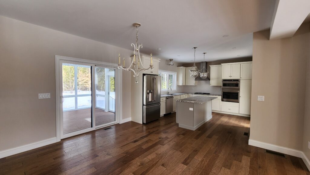
Warm tones are having a true moment. They add life without shouting, soften harsh shadows, and pair naturally with common finishes like warm wood floors, creamy trim, and stone. In open layouts, warmer colors also help rooms flow into each other so the home feels connected.
The Cozy Neutrals And Deep Browns
Rich espresso browns with charcoal undertones. These shades bring depth and a grounded feel, especially in living rooms, dining rooms, and bedrooms. They are strong on an accent wall, but they can also work in a whole room when the space has decent natural light. Benjamin Moore’s Silhouette AF-655 fits the trend with a warm brown base and a charcoal influence that keeps it from turning red. Creamy whites, natural oak, and warm metals tend to make espresso colors feel intentional rather than dark.
Warm khaki neutrals. When calm is the goal, warm khaki and modern taupe tones deliver. They anchor open concept spaces without making a room feel bland. Sherwin-Williams Universal Khaki SW 6150 is a good example of the gentle, earthy neutral homeowners are choosing right now. These tones also handle shifting daylight well, which matters in winter when a wall can look different at 10 a.m. than it does under lamps at night.
Greens And Soft Whites That Still Feel Warm
Smoky jades and muted greens. Muted greens are trending because they feel soothing but still interesting. They are popular in bedrooms, offices, powder rooms, and dining spaces where a quieter mood helps the room feel more intentional. Behr Hidden Gem often comes up here because it has depth without feeling dramatic. It looks soft in daylight and a touch moodier at night, which creates a layered look without needing a lot of décor.
Warm eucalyptus greens. Eucalyptus-inspired greens feel gentle and restorative. They work well in kitchens, bathrooms, and entryways where harsh color can feel like too much. Valspar Warm Eucalyptus fits the direction. These tones also translate beautifully to cabinet painting. Warm green cabinets can refresh a kitchen without changing the layout or replacing finishes.
Soft, lofty whites. Whites are still popular, but the shift is toward whites with warmth rather than sharp, icy whites. Pantone Cloud Dancer fits that softer look and can work for walls, trim, or ceilings. Warm whites also make it easier to pair earthy browns and greens without harsh contrast, especially in rooms with limited winter daylight.
Colors That Are Falling Out Of Favor In 2026
Trends change because the way people want their homes to feel changes. Cooler tones that once felt modern are starting to feel a little distant in everyday spaces.
Cool grays often read flat and chilly, particularly in winter light. Stark whites can look too sharp. Icy pastels can drain warmth. Very cool blues and greens still have a place, but many homeowners are choosing warmer versions for main living areas because they want comfort more than crispness.
None of this means a cooler color is “wrong.” It just means undertone matters more than ever. A small shift from cool to warm is often enough to change how a room feels.
Highlighting The Standout Colors Of The Year
Color of the Year picks tend to mirror the mood people are already feeling. The standouts for 2026 lean into comfort and nature, with colors that feel calm instead of showy.
What makes this year’s palette especially useful is how well the colors layer together. A warm khaki in a main living area, a muted green in a bedroom, and a soft, warm white on trim can make a whole home feel cohesive without looking matchy. For anyone who wants to experiment, smaller spaces like a powder room, mudroom, or hallway are perfect testing grounds.
How To Choose Colors That Truly Work For Your Home
Trends are fun to browse, but the best color is the one that fits daily life.
- Start with the feeling the room should create. Cozy and safe. Light and open. Calm and quiet. Then consider how the room is used. A busy kitchen can handle deeper color than a dim hallway. A bedroom usually benefits from softer shades that feel restful. A home office often does better with color that feels steady and focused.
- Light is the deal breaker. Paint shifts from morning sun to afternoon brightness to evening lamplight, and seasonal light changes matter too. The safest move is testing: paint large sample patches and leave them up for a few days. Watch them in daylight and at night before committing.
- Fixed finishes matter. Floors, countertops, cabinets, and large furniture set the baseline. When undertones align, a room looks calmer and decorating gets easier over time.
- For older homes, prep should be thoughtful. Many houses built before 1978 may have lead-based paint under newer layers, and sanding or scraping can create lead-contaminated dust. The CDC’s guidance explains why lead in paint and dust can be a serious concern, especially for families with children.
Expert Tips For A Flawless Update
A great color can still fall flat if the finish looks rushed:
- Prep and product choices matter.
- Test big, not small. Paint chips are misleading, especially with warm undertones.
- Prep properly. Clean walls, patch and sand where needed, and prime where appropriate. Good prep helps paint level out better and hold up longer in high-traffic areas.
- Choose sheen with intention. Eggshell is a dependable choice for most walls. Satin or semi-gloss often makes sense for trim because it handles cleaning better.
- Cabinet painting deserves extra care. Cabinets need thorough cleaning and the right primer because they get touched constantly.
Safety matters too, particularly with spray finishes or certain coatings. Isocyanates, which can be present in some spray-applied polyurethane products, are powerful irritants and can affect the respiratory tract, so ventilation and protective steps should be taken seriously.
These 2026 colors bring what many Southern New Hampshire homes are craving right now: warmth, ease, and quiet comfort. Honest Brothers Painting serves Nashua, Manchester, Merrimack, Bedford, Hudson, Londonderry, Derry, Amherst, Hollis, and Concord with craftsmanship, care, and a service mindset rooted in faith and compassion. Whether you are painting or repainting, your home deserves walls that feel peaceful instead of cold, reach Honest Brothers Painting and let the first brushstroke feel like a fresh start.